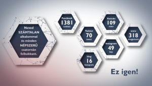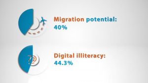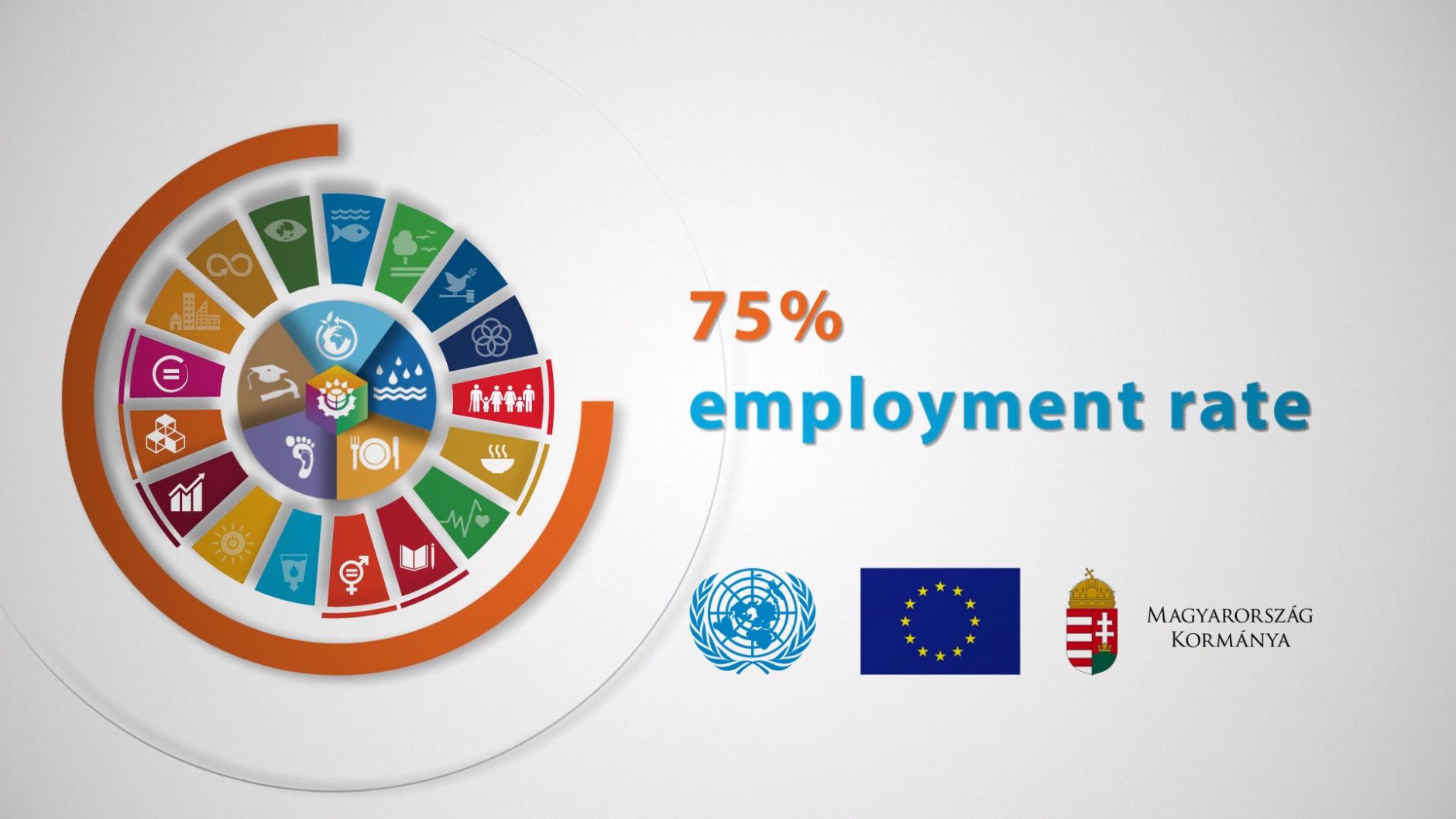
In the first part, we introduced the storyteller explainer video. Another popular branch of explainer videos is data-centered animation, or data visualization, which focuses on numbers, graphs, and tables instead of characters and locations. The genre itself is not new, and many elements of the 2011 trend of kinetic typography or motion typography have been transferred to data-centered explainer videos. Another important source is animated infographics, or infographics animation, which is the collective name for various opening, closing, and drawing graphics and charts. By adding the two elements together, we get the data-centered explainer.
This type of animation is most useful when numerical data is absolutely necessary for selling or introducing a product/company. While most traditional commercials avoid this awkwardly, choosing emotional persuasion as the main dramatic element, the explainer video is able to present data that is otherwise dry and not very attractive, but still has serious marketing value.

Data-centered explanatory animation, or data visualization, is typically chosen by clients who find the tone of traditional explainer videos too cheerful or frivolous. While we don’t think that an explainer should always look the same, there is a market trend that portrays explanatory videos as the adventures of stumbling, cartoonish characters. Typically, the bigger the company, the less it wants to present itself with characters, and that’s when animated infographics come into play.
These materials are particularly effective when the target audience is too broad and hard to grasp. For example, one of our clients mass-orders data-centered explainers from us, which they then send to a variety of media outlets. In these cases, it’s better to not have a fully developed story or drawn world, since the simple, subdued data visualization is sure to be liked by everyone. It is also important to note that animation using data is always significantly cheaper than a thoroughly developed world.

However, the main decision-making question is the nature of the given communique, i.e. the message suggested by the video. If we want to convey a feeling of life, happiness, or simplicity and ease about our product, we should choose storytelling. If, however, we want to convince our partners on a professional basis or present the results of our company, data visualization / data-centered explanatory animation can be of great service to us.


You must be logged in to post a comment.