 Live streams or live broadcasts have always been present in our lives, but they became really popular during the COVID pandemic. The event industry has often turned to this tool out of necessity for lack of a better alternative, but this gave us the opportunity to come up with a new, higher-level aesthetic, which we plan to use in our live streams in the future.
Most clients are aware that a live stream will be much better with an overall animation branding, but not every production follows this plan consistently. This is precisely why the Mimicry animation studio came up with the idea of combining our knowledge of television and event LED walls to create our own internal rule system, along which we build our live stream design. An average live stream design in a competing studio means only a few videos, but our animation demand list for a single event can be up to 200 items. In most cases, clients don’t even participate in the micromanaging of the production, they just ask us to do it the way we think is good – and they don’t have to be disappointed.
The basic principle is that there is no branding element that is not animated. Everything which an average production solves with PowerPoint, or fixed images and keyed out titles, will become animated videos under our hands, which we integrate seamlessly into the workflow. Starting from the name inserts in the lower third to sponsor logos or transmission error messages, we create a unique design for everything, which brings the visual world of live streams to a new level.
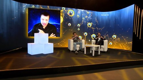
 In most cases, the live stream takes place in a studio space, where a LED wall can be seen behind the speakers. In this space there are often a few spectators present in person, but in most cases it is exclusively reserved for the crew. Either way, the studio LED wall is the most important branding element, so we always start our work on this surface.
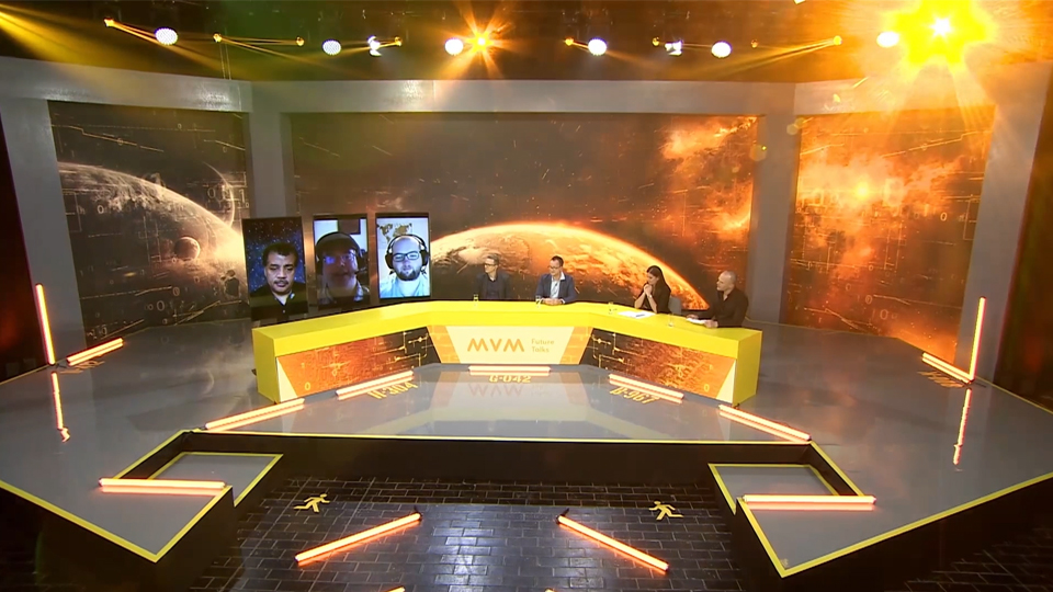
There are many different LED backgrounds, but we always recommend incorporating a visual idea, an unconventional solution. One of these is the curved LED wall, like the one we used for MVM Future Talks 2021, which frames the space in a very exciting way, while defining the visual world of the entire broadcast.
 If the LED wall is conventional, we are still able to achieve exciting twists with animation. At the sortilege of the EHF European Handball Championship, for example, we had to work with a completely traditional, straight, rectangular LED wall. The client’s branding was curved and circular, so we decided to use visual tricks to make the LED wall look circular as well. The human eye can be fooled easily by relative brightness, and we took advantage of this here: we used a frame consisting of very bright and light colors in the animation, and then masked it with completely black arcs. This way, the effect looks as if the LED wall had a lowered, unconventional shape, although this is not the case at all.
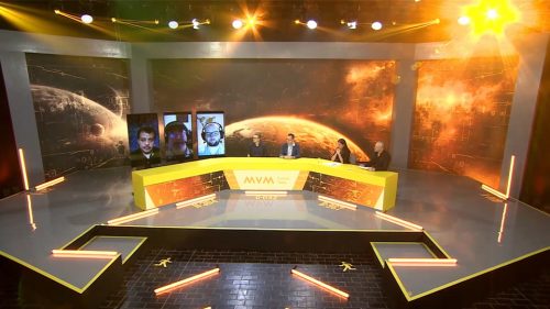
It is also true for both examples above that in the studio space there is a table as well. The front surface of this table is also made up of LED panels. LED tables provide an excellent opportunity to display additional information on them, and to make the space of the live stream studio even more exciting by moving animation elements.


You must be logged in to post a comment.