We have been honored to create the moving PR materials for the 2017 season of the 50 Talented Young Hungarians program. The program supports internationally outstanding young talents with the mentorship of the most influential figures in science, business, and the arts. The spine of the collaboration was 50 video interviews, in which the talents talk about their plans and dreams.
A customer’s video marketing communication requires strict control and sophisticated visual design for such a project. Both live action footage and animations are equally important, and the combination of these gives Mimicry’s main area of expertise. Since we took care of the entire production of the project, we were given complete creative freedom by our clients.
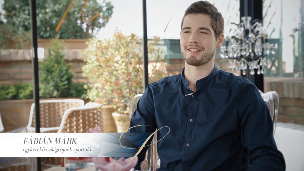
 The PR film footage was shot with set lighting, on a suitable, representative location (the renowned Aria Hotel) with two cameras, on a rail, with great care. What makes the material truly special is the visual unity with which the rest of the brand and the recorded videos meet.
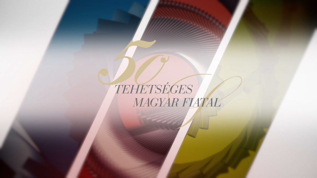
Today, trendy logo animations are mainly based on abstract 3D geometric shapes. Of course, there can be variations, but the bigger a company is and the more it wants to suggest cleanliness, the more abstract the shapes become. Since the logo of the 50 Talented Young Hungarians program already contains a decorative, ornate part, it was particularly important that the 3D content remained in the background, highlighting the logo, not suppressing it.
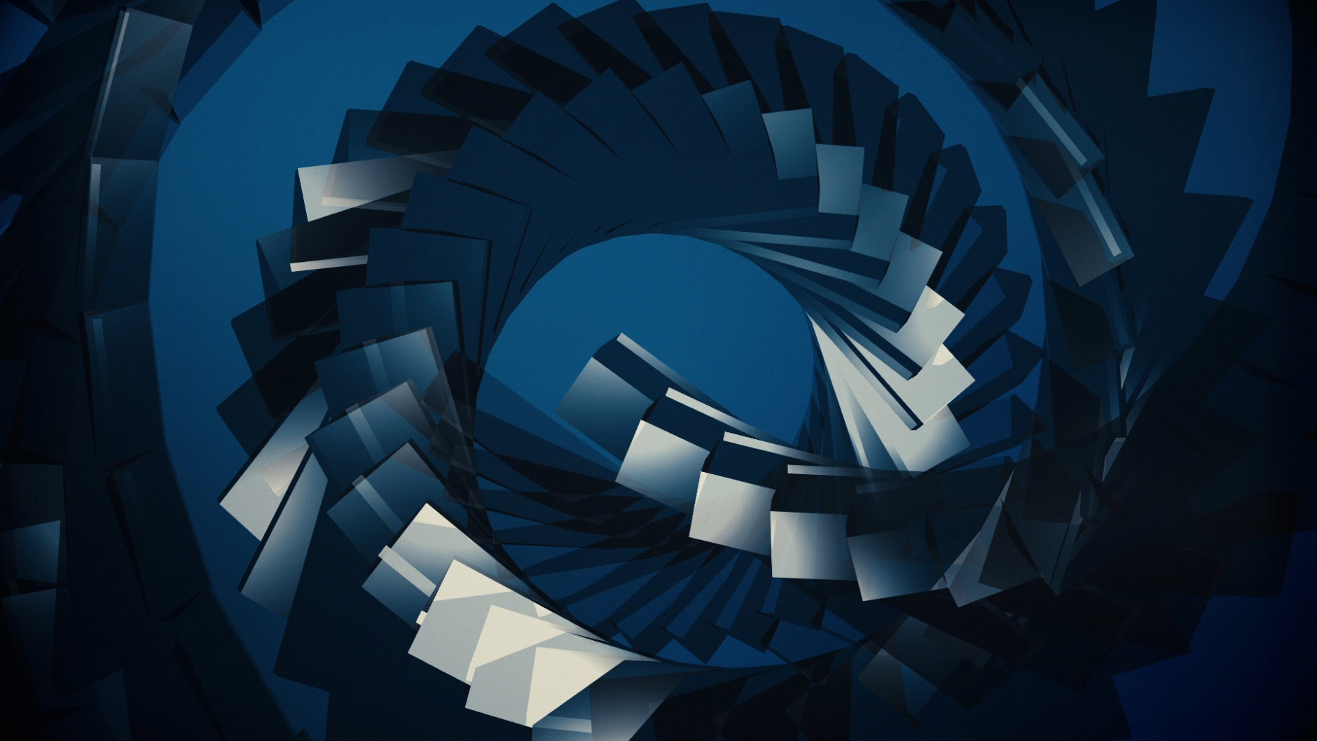
 A good animation not only highlights the logo, but also has a specific content with its visual language that reflects the values of the company. In the case of the 50 Talented Young Hungarians program, we see three different patterns that symbolize the diversity of the talented people participating in the program. The patterns, although they are different, all depict a common shape, which is a spiral, representing the uniform inner value system of the different talents.
One of the most challenging tasks is integrating text elements like names, titles, and end credits into the design, as these are compulsory elements that do not carry their own value and do not have any real merit beyond their functionality. However, it is not allowed to omit them. We incorporated the arch of the logo ribbon into the creative of the PR interviews in the following ways: the arch of the closing of the name insert is defined by the ribbon of the logo, making the name insert, which would otherwise be a robust, square-shaped element, appear much more airy and light. In addition, in the credit sequence that ends the films, we also displayed another arch, also taken from the logo. To make both captions more dynamic, we also displayed the movement of the logo animation’s 3D elements in them. These seemingly small details communicate precision, professionalism, and harmony on a subconscious level.


You must be logged in to post a comment.